
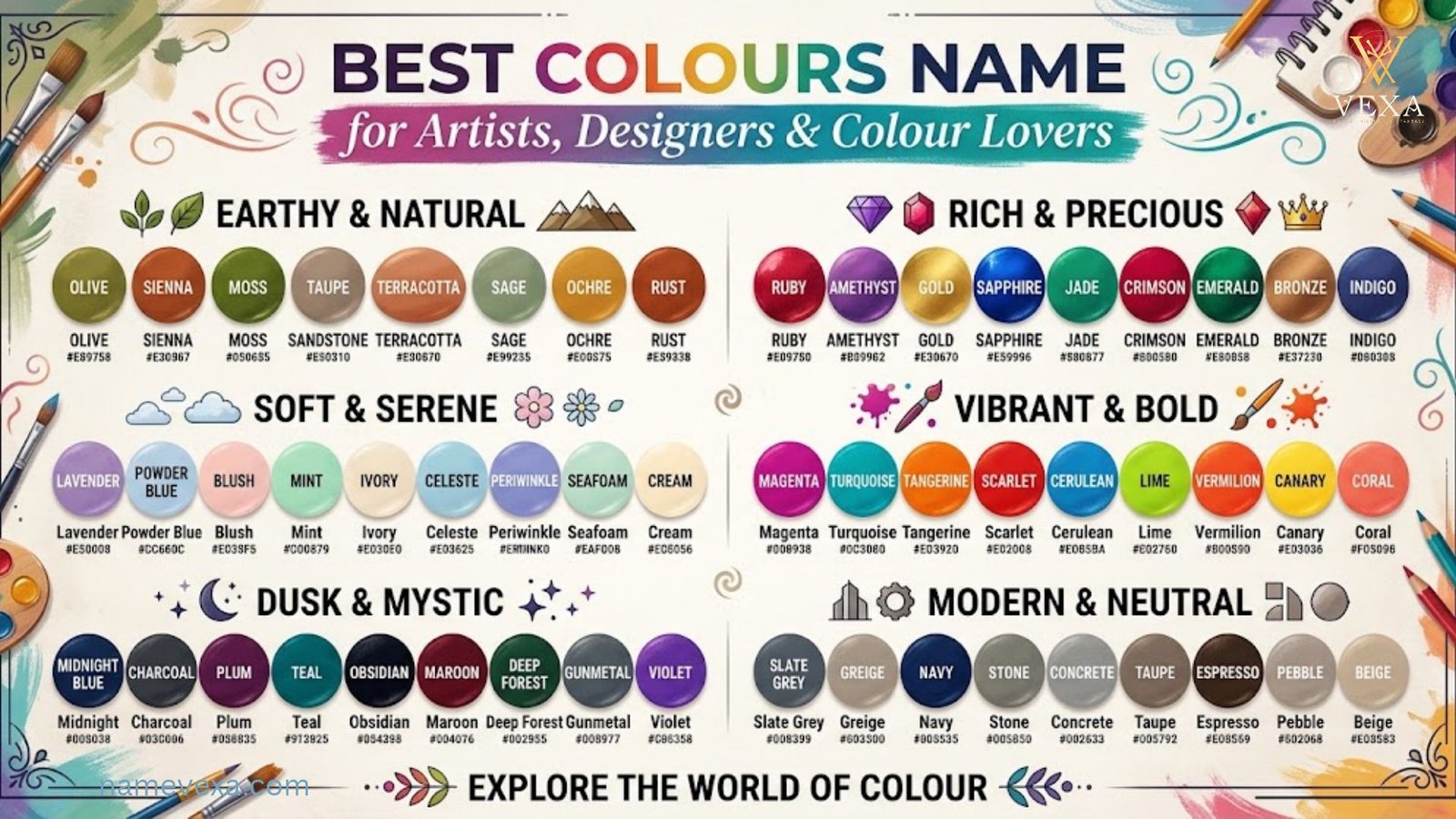
Colours are more than just shades; they are emotions, memories, and stories painted across our world. From the soft blush of a morning sky to the deep indigo of a midnight ocean, every colour has a name that gives it identity. Knowing the right colours name helps you describe what you see, express what you feel, and connect with others more clearly.
Whether you are a student learning the basics, a designer hunting for the perfect shade, or simply curious about the rainbow around you, this guide is made for you. Explore common colour names in English, discover fascinating shades beyond red, blue, and green, and learn how each hue can inspire your creativity, home, wardrobe, or next big idea. Let’s dive into the colourful world together!
Red Colour Names
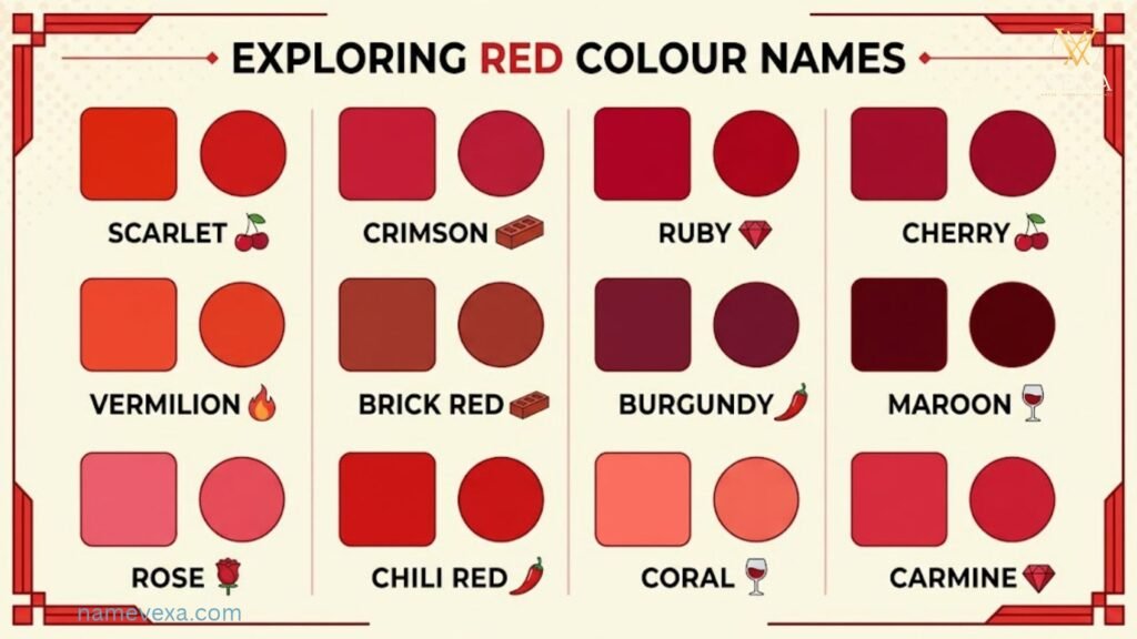
Red is the first colour most of us name and the last one we forget. It can be a soft cherry blush or a deep, moody wine. Here are 30 red shades, each with a hex code you can use in design, branding or home décor.
- Crimson – #DC143C
- Scarlet – #FF2400
- Ruby – #E0115F
- Cherry – #DE3163
- Burgundy – #800020
- Maroon – #800000
- Cardinal – #C41E3A
- Carmine – #960018
- Vermilion – #E34234
- Brick Red – #CB4154
- Rose Red – #C21E56
- Wine – #722F37
- Candy Apple – #FF0800
- Garnet – #733635
- Fire Engine Red – #CE2029
- Cranberry – #9F000F
- Blood Red – #660000
- Rust Red – #B7410E
- Tomato – #FF6347
- Raspberry – #E30B5C
- Lava – #CF1020
- Chili Red – #C21807
- Poppy – #E35335
- Imperial Red – #ED2939
- Persian Red – #CC3333
- Redwood – #A45A52
- Coral Red – #FF4040
- Sangria – #92000A
- Pomegranate – #C0262D
- Mahogany – #C04000
Red Colour Psychology
Red gets attention before you’ve even decided to look. It is tied to blood, fire and heartbeat, so the body reacts to it quickly. It can raise energy, speed up your pulse and make you feel more alert.
That’s why red appears on stop signs, sale tags and “Buy Now” buttons. It signals urgency and importance, and in many cultures it also stands for love, passion and good fortune.
Red has a darker side too. In large doses it can feel aggressive, stressful or overwhelming, and it is linked to anger and danger. Use it as an accent for impact, such as a red door, a statement chair or a call-to-action button. Avoid covering a whole space or page in it.
Quick traits: passion, power, courage, urgency, appetite, love, warning.
Orange Colour Names
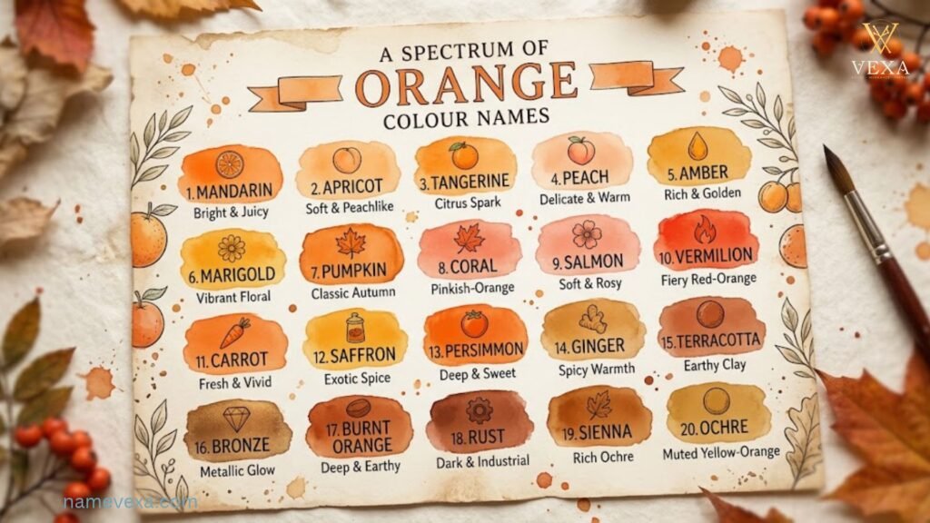
Orange sits between the energy of red and the cheer of yellow, so its shades run from soft peach to deep burnt amber. Here are 30 orange names to inspire your next palette.
- Tangerine – #F28500
- Amber – #FFBF00
- Burnt Orange – #CC5500
- Pumpkin – #FF7518
- Apricot – #FBCEB1
- Peach – #FFE5B4
- Coral – #FF7F50
- Carrot – #ED9121
- Papaya – #FFEFD5
- Marigold – #EAA221
- Cantaloupe – #FFA877
- Pumpkin Spice – #E4752F
- Copper – #B87333
- Terracotta – #E2725B
- Sunset Orange – #FD5E53
- Mango – #FF8243
- Blaze Orange – #FF6700
- Cinnamon – #D2691E
- Persimmon – #EC5800
- Safety Orange – #FF7900
- Clementine – #E96A17
- Ochre – #CC7722
- Salmon – #FA8072
- Tiger Orange – #FC6A03
- Flame – #E25822
- Pure Orange – #FFA500
- Honey – #EB9605
- Butterscotch – #E09540
- Nectarine – #FF8C69
- Rust – #B7410E
Orange Colour Psychology
Orange feels like a good mood. It is warm and social, a little playful, and hard to take too seriously. Think of sunsets, citrus and autumn leaves: things we associate with enjoyment and change.
Psychologically, orange is linked to enthusiasm, creativity and friendliness. It can encourage conversation, which is why it shows up in cafés, kids’ spaces and brands that want to feel approachable. It is also known for stimulating appetite.
Too much orange can feel loud or cheap, and some people find bright oranges tiring. Softer tones like peach and terracotta keep the warmth without the intensity. Orange also works well for buttons and highlights, since it grabs attention without the aggression of red.
Quick traits: energy, creativity, warmth, adventure, optimism, friendliness.
Yellow Colour Names
Yellow is sunshine in a swatch. It can be a bright lemon pop, a rich gold or a gentle buttery cream. Here are 30 yellow names with hex codes.
- Lemon – #FFF700
- Canary – #FFEF00
- Mustard – #FFDB58
- Gold – #FFD700
- Sunflower – #FFDA03
- Banana – #FFE135
- Buttercup – #F3E03B
- Honey Yellow – #FFC30B
- Goldenrod – #DAA520
- Saffron – #F4C430
- Citrine – #E4D00A
- Maize – #FBEC5D
- Cream – #FFFDD0
- Vanilla – #F3E5AB
- Daffodil – #FFFF31
- Dandelion – #F0E130
- Corn Silk – #FFF8DC
- Jasmine – #F8DE7E
- Flax – #EEDC82
- Straw – #E4D96F
- Champagne – #F7E7CE
- School Bus – #FFD800
- Lemon Chiffon – #FFFACD
- Sunshine – #FFFD37
- Citron – #9FA91F
- Primrose – #EDEA82
- Turmeric – #E3B130
- Hazard – #FFD300
- Pineapple – #E9D66B
- Sand – #C2B280
Yellow Colour Psychology

Yellow is the colour of happiness, and most of us feel it before we think about it. It reminds us of daylight, summer and fresh starts, and it tends to lift mood and spark optimism.
It is also the most visible colour to the human eye, which is why it’s used for taxis, caution signs and highlighters. In design, yellow can make a space feel brighter, bigger and more welcoming.
But yellow is a balancing act. Too much can feel anxious or harsh, and very bright yellow can cause eye strain. Pale yellows are calming, while golden and mustard tones feel more premium and cosy. A little yellow goes a long way: a cushion, a logo accent or a single wall can bring joy without overwhelming the room.
Quick traits: happiness, optimism, clarity, intellect, caution, youthfulness.
Grey Colour Names & Shades
Grey is far from boring. It can be icy and modern, soft and cosy, or dark and dramatic. Here are 30 grey names, from near-white mist to deep charcoal.
- Charcoal – #36454F
- Slate – #708090
- Ash – #B2BEB5
- Silver – #C0C0C0
- Gunmetal – #2A3439
- Graphite – #41424C
- Smoke – #738276
- Pewter – #899499
- Steel – #71797E
- Dove Grey – #B6B6B4
- Fog – #D0D3D4
- Stone – #928E85
- Platinum – #E5E4E2
- Light Grey – #D3D3D3
- Battleship – #848482
- Storm – #4F666A
- Iron – #48494B
- Cool Grey – #8C92AC
- Warm Grey – #808069
- Pebble – #B5B3AC
- Concrete – #95A5A6
- Mist – #C8CFD0
- Shadow – #5A5A5A
- Onyx – #353839
- Ghost – #C7C9D3
- Taupe Grey – #8B8589
- Cadet Grey – #91A3B0
- Gainsboro – #DCDCDC
- Lead – #646464
- Elephant – #939597
Grey Colour Psychology
Grey is the colour of balance. It isn’t loud and it doesn’t compete with other colours, which makes it calm, mature and sophisticated. Designers love it because it makes everything around it look better.
Light greys feel clean, airy and modern. Mid greys feel neutral and professional, which is why they’re common in corporate branding and tech. Dark greys such as charcoal feel strong, serious and luxurious.
The downside is that too much grey can feel cold, dull or emotionally flat. It is often linked to indecision or detachment. To keep it warm, pair grey with soft textures, natural wood or a pop of colour like mustard, blush or teal.
Green Colour Names
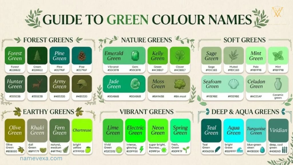
Green is the colour of growth, calm and fresh starts. It runs from zesty lime to deep forest, and there is a shade for every mood. Here are 24 green shades with hex codes for design, branding and home décor.
- Emerald: #50C878
- Forest Green: #228B22
- Sage: #9CAF88
- Olive: #808000
- Mint: #98FF98
- Jade: #00A86B
- Hunter Green: #355E3B
- Lime: #32CD32
- Pine: #01796F
- Moss: #8A9A5B
- Fern: #4F7942
- Kelly Green: #4CBB17
- Seafoam: #9FE2BF
- Avocado: #568203
- Pistachio: #93C572
- Shamrock: #009E60
- Basil: #579229
- Juniper: #3A5F41
- Chartreuse: #7FFF00
- Army Green: #4B5320
- Celadon: #ACE1AF
- Malachite: #0BDA51
- Verdigris: #43B3AE
- Artichoke: #8F9779
Green Colour Psychology
Green is what the eye finds easiest to rest on. Our brains link it with trees, grass and clean air, so it feels safe, balanced and refreshing almost instantly.
It’s tied to growth, health and renewal, which is why wellness brands, banks and eco-friendly companies lean on it. Soft greens like sage and mint calm the mind, while deep greens such as emerald and forest feel rich, stable and quietly luxurious.
Green has a shadow side too. Murky or yellow-toned greens can suggest envy, sickness or stagnation. To keep it fresh, pair green with natural wood, warm whites or a touch of gold.
Quick traits: growth, harmony, health, renewal, nature, stability, prosperity.
White Colour Names & Shades
White is never just white. It can be crisp and clinical, creamy and warm, or soft and dreamy. Here are 24 white shades, from pure snow to gentle off-whites that make a room feel instantly bigger.
- Snow: #FFFAFA
- Ivory: #FFFFF0
- Pearl: #F8F6F0
- Alabaster: #EDEAE0
- Cream: #FFFDD0
- Eggshell: #F0EAD6
- Linen: #FAF0E6
- Porcelain: #F0EEE9
- Milk: #FDFFF5
- Chalk: #F5F5F0
- Bone: #E3DAC9
- Ghost White: #F8F8FF
- Cotton: #FBFBF9
- Magnolia: #F8F4FF
- Seashell: #FFF5EE
- Old Lace: #FDF5E6
- Coconut: #FFFAF0
- Salt: #FAFAFA
- Antique White: #FAEBD7
- Frost: #E8F4F8
- Swan: #F7F7F2
- Cloud: #F4F6F7
- Paper: #FAF9F6
- Marshmallow: #FFF8F0
White Colour Psychology
White is the colour of a clean slate. It stands for purity, simplicity and new beginnings, and it gives the mind room to breathe. That’s why it’s loved in minimalist design, healthcare, weddings and tech.
White reflects light, so it makes small spaces feel open and bright. Cool whites feel crisp and modern, while warm whites like ivory and cream feel gentle and welcoming.
Used on its own, white can feel cold, sterile or empty. Add texture, soft shadows and a few colourful accents to give it personality. Note that in some Eastern cultures white is also linked with mourning, so context matters.
Quick traits: purity, simplicity, peace, cleanliness, openness, fresh starts.
Blue Colour Names

Blue is the world’s favourite colour, and it’s easy to see why. It can be a bright summer sky, a deep ocean or a midnight horizon. Here are 24 blue shades with hex codes.
- Navy: #000080
- Royal Blue: #4169E1
- Sky Blue: #87CEEB
- Cobalt: #0047AB
- Azure: #007FFF
- Sapphire: #0F52BA
- Cerulean: #007BA7
- Turquoise: #40E0D0
- Baby Blue: #89CFF0
- Powder Blue: #B0E0E6
- Midnight Blue: #191970
- Denim: #1560BD
- Ultramarine: #3F00FF
- Periwinkle: #CCCCFF
- Steel Blue: #4682B4
- Cornflower: #6495ED
- Indigo: #4B0082
- Prussian Blue: #003153
- Ocean Blue: #006994
- Electric Blue: #7DF9FF
- Aqua: #00FFFF
- Ice Blue: #99FFFF
- Lapis: #26619C
- Peacock: #33A1C9
Blue Colour Psychology
Blue is the colour of trust. It brings to mind open skies and calm water, and it tends to slow the heartbeat and settle the mind. No surprise that banks, hospitals and tech giants use it so often.
Light blues feel peaceful, friendly and refreshing. Darker blues like navy signal authority, intelligence and reliability. Blue is also associated with focus, which makes it a smart choice for offices and study spaces.
On the flip side, blue can feel cold, distant or sad, as in “feeling blue.” Warm it up with wood tones, soft yellows or touches of coral. It’s also one of the few colours that suppresses appetite, so it’s rarely used in food branding.
Quick traits: trust, calm, loyalty, intelligence, stability, focus, serenity.
Purple and Violet Colour Names
Purple has always felt a little magical. It sits between the energy of red and the calm of blue, producing shades that range from soft lavender to rich royal plum. Here are 24 purple and violet names with hex codes.
- Lavender: #E6E6FA
- Violet: #8F00FF
- Amethyst: #9966CC
- Plum: #8E4585
- Lilac: #C8A2C8
- Orchid: #DA70D6
- Mauve: #E0B0FF
- Eggplant: #614051
- Grape: #6F2DA8
- Royal Purple: #7851A9
- Wisteria: #C9A0DC
- Thistle: #D8BFD8
- Byzantium: #702963
- Iris: #5A4FCF
- Mulberry: #C54B8C
- Aubergine: #3B0A45
- Purple: #800080
- Electric Purple: #BF00FF
- Pansy: #78184A
- Boysenberry: #873260
- Heliotrope: #DF73FF
- Tyrian Purple: #66023C
- Dusty Lilac: #B9A2B8
- Very Peri: #6667AB
Purple Colour Psychology

For centuries purple dye was so rare and costly that only royalty could wear it. That history still clings to the colour: it feels luxurious, creative and a little mysterious.
Purple blends the stability of blue with the intensity of red, so it’s linked to imagination, spirituality and wisdom. Light purples like lavender and lilac feel soothing and romantic. Deep shades such as plum and aubergine feel dramatic and premium, which is why beauty and luxury brands love them.
Too much purple can feel heavy, moody or overly dreamy. Balance it with neutrals like grey, cream or white, or add gold accents for a regal finish.
Quick traits: creativity, luxury, imagination, spirituality, wisdom, mystery, elegance.
Pink Colour Names
Pink is more than sweet and girly. It can be bold and electric, soft and calming, or earthy and sophisticated. Here are 24 pink shades with hex codes, from pale blush to vivid fuchsia.
- Blush: #DE5D83
- Rose: #FF007F
- Baby Pink: #F4C2C2
- Hot Pink: #FF69B4
- Fuchsia: #FF00FF
- Salmon Pink: #FF91A4
- Cotton Candy: #FFBCD9
- Bubblegum: #FFC1CC
- Flamingo: #FC8EAC
- Peony: #E8A0BF
- Carnation: #FFA6C9
- Coral Pink: #F88379
- Dusty Rose: #C08081
- Rose Gold: #B76E79
- Watermelon: #FD4659
- Orchid Pink: #F2BDCD
- Shocking Pink: #FC0FC0
- Pastel Pink: #FFD1DC
- Millennial Pink: #F3CFC6
- Cherry Blossom: #FFB7C5
- Strawberry: #FC5A8D
- Tulip: #FF878D
- Raspberry Pink: #E25098
- Barbie Pink: #E0218A
Pink Colour Psychology
Pink is often written off as sweet and nothing more, but it is one of the most emotionally interesting colours. It softens a room, a face and a mood. Pink is tied to care, kindness and affection, and studies on colour and mood often link soft pinks with feeling calm and looked after.
Shade changes everything. Pale blush and baby pink feel gentle, nostalgic and safe. Dusty rose and rose gold feel grown-up, elegant and a little romantic. Hot pink and fuchsia are bold and playful, and they ask to be noticed. That range is why pink works for beauty brands, bakeries, wellness apps and fashion.
Pink has a downside. Too much sugary pink can feel childish or overly sweet, and in some settings it can be dismissed as unserious. Ground it with charcoal, olive, navy or warm cream to keep it modern.
Quick traits: compassion, romance, playfulness, nurturing, softness, youthfulness, femininity.
Teal Colour Names & Shades
Teal is what happens when blue’s calm meets green’s freshness. It is deep, a little mysterious and very photogenic, which is why it keeps showing up in interiors, fashion and branding. Here are 40 teal names with hex codes.
- Classic Teal – #008080
- Deep Teal – #014D4E
- Dark Cyan – #008B8B
- Peacock – #005F69
- Lagoon – #1B9AAA
- Turquoise – #40E0D0
- Aquamarine – #7FFFD4
- Caribbean Sea – #00B3A4
- Ocean Teal – #127C85
- Mermaid – #2AA9A0
- Sea Glass – #A4D6CF
- Jade Teal – #0A8F87
- Spruce – #0F5E5A
- Harbour – #2E7F86
- Tidepool – #1F7A80
- Lake Teal – #3A9CA6
- Blue Lagoon – #00A5A8
- Arctic Teal – #8FD3D1
- Mineral Teal – #3E8E8B
- Dusty Teal – #6FA3A1
- Cyan Mist – #B8E6E6
- Midnight Teal – #06393D
- Pool Blue – #5CC8D0
- Reef – #1AA7A1
- Eucalyptus Teal – #4F9D9A
- Glacier – #9FD8DA
- Copper Patina – #4AA39B
- Storm Teal – #335E63
- Seaweed – #2C6E6A
- Tropical Teal – #00968F
- Persian Green – #00A693
- Ocean Mist – #7FB8B5
- Petrol – #1B4F55
- Bluebird – #4DB6C4
- Cool Mint Teal – #66C7BE
- Smoky Teal – #587E80
- Abyss – #083D41
- Surf – #3FB8AF
- Aqua Teal – #12B5B0
- Frosted Teal – #C9E8E6
Teal Colour Psychology
Teal is the colour of a deep breath. It takes the trust and stability of blue and mixes in the renewal of green, so it feels calm without being sleepy and fresh without being loud.
Psychologically, teal is linked to clear thinking, emotional balance and communication. That is why you see it in wellness brands, spas, healthcare and creative studios. Darker teals such as peacock and petrol feel sophisticated and confident. Lighter ones like sea glass and aquamarine feel playful, breezy and open.
Teal can feel cold if it’s used alone, and very bright turquoise can come across as loud. Pair it with warm partners such as mustard, coral, terracotta or brass, and it comes alive.
Quick traits: balance, clarity, calm, renewal, sophistication, creativity, healing.
Brown and Beige Colour Names
Brown and beige are the colours of earth, coffee, wood and sand. They feel grounded, warm and easy to live with, and they never go out of style. Here are 40 shades, 20 browns and 20 beiges.
Brown shades
- Chocolate – #7B3F00
- Coffee – #6F4E37
- Chestnut – #954535
- Walnut – #773F1A
- Mocha – #967969
- Caramel – #C68E17
- Hazelnut – #A67B5B
- Espresso – #4B3621
- Sienna – #A0522D
- Umber – #635147
- Sepia – #704214
- Tan – #D2B48C
- Camel – #C19A6B
- Toffee – #755139
- Russet – #80461B
- Bronze – #CD7F32
- Cedar – #5E3A27
- Hickory – #5C4033
- Pecan – #6E4B2A
- Dark Cocoa – #3C2218
Beige shades
- Beige – #F5F5DC
- Oatmeal – #D8CFBE
- Latte – #C5A582
- Fawn – #E5AA70
- Khaki – #C3B091
- Taupe – #483C32
- Buff – #F0DC82
- Almond – #EFDECD
- Wheat – #F5DEB3
- Parchment – #F1E9D2
- Nude – #E3BC9A
- Driftwood – #AF8F6F
- Mushroom – #B7A99A
- Greige – #B8AFA3
- Biscotti – #DDC9A3
- Cashew – #C9A57A
- Dune – #A99B82
- Ecru – #C2B280
- Stone Beige – #D6CDBE
- Sandstone – #C9B79C
Brown Colour Psychology
Brown feels like home. It is the colour of soil, wood and a warm mug of coffee, so it comes across as dependable, honest and comforting. It does not shout, and it doesn’t need to.
Light browns and beiges feel relaxed, natural and welcoming. Rich browns like chocolate and walnut feel stable, secure and quietly luxurious. Brands choose brown when they want to say “real,” “reliable” or “handcrafted,” from coffee shops to leather goods to delivery companies.
The risk is dullness. Too much brown can feel heavy, dated or flat. Layer different textures, add cream or sage for freshness, and bring in a little metallic or colour for sparkle.
Quick traits: reliability, warmth, comfort, stability, earthiness, authenticity, security.
Black, White and Grey Colour Names
These three neutrals are the backbone of every palette. They carry the drama, the calm and the contrast. Here are 40 shades, 13 black, 13 white and 14 grey.
Black shades
- Jet Black – #0A0A0A
- Ebony – #3B3C36
- Obsidian – #0B1215
- Midnight – #0D0D12
- Coal – #1A1A1A
- Licorice – #1A1110
- Pitch Black – #000000
- Soot – #212121
- Tar – #1B1B1B
- Eclipse – #1E1E24
- Noir – #151515
- Panther – #252525
- Shadow Black – #111111
White shades
- Pure White – #FFFFFF
- Arctic White – #F4FAFF
- Lily – #F8F8F2
- Bright White – #FDFDFD
- Powder – #F6F7F9
- Whisper White – #F3F1EC
- Moonlight – #F2F4F7
- Daisy – #FBF9F4
- Starlight – #F5F7FA
- Sugar – #FFFDF9
- Angel White – #FAF8FF
- Rice – #F7F4EA
- Lace – #FCFAF5
Grey shades
- Charcoal – #36454F
- Slate Grey – #708090
- Smoke Grey – #848884
- Anthracite – #2F3437
- Flint – #6F6F6F
- Cloud Grey – #C4C7CB
- Titanium – #878681
- Nickel – #727472
- Gravel – #8A8D8F
- Thunder – #4A4E52
- Heather – #9AA0A6
- Asphalt – #3A3D40
- Moonstone – #A9ADB1
- Mercury – #E5E5E5
Black Colour Psychology
Black is power, mystery and elegance in one colour. It is the shade of the tuxedo, the leather jacket and the night sky, so it signals authority, sophistication and strength. It also makes everything placed against it look sharper.
In design, black adds drama and contrast. Luxury and fashion brands use it because it feels exclusive and confident. Minimalists use it because it says a lot with very little.
Black carries heavier meanings too. It is linked with mourning, secrecy and fear in many cultures, and a space with too much black can feel closed in or oppressive. Soften it with natural light, warm wood, white space and a metallic accent such as gold or brass.
Quick traits: power, elegance, sophistication, mystery, authority, formality, strength.
How to Use These 100 Colour Names in Daily Life
A colour list is only useful if you put it to work. Here are practical ways to use these names every day.
At home. Pick a “hero” colour, a supporting colour and a neutral. For example, a petrol teal sofa, oatmeal walls and a touch of caramel in cushions. Naming shades helps when you talk to a painter or shop for fabric, because “sage” is far clearer than “that greenish one.”
In your wardrobe. Build outfits around three colours, one bold and two neutrals. A mustard top, charcoal trousers and a cream jacket always works. Knowing shade names makes online shopping and filtering much easier.
For design projects. Copy hex codes straight into Canva, Figma or Photoshop. Save your favourites as a palette so your posters, slides and social posts look consistent.
To set a mood. Use blues and teals for focus, greens for relaxation, yellows and oranges for energy, and deep neutrals for a cosy evening feel.
For gifts and events. Match flowers, wrapping and table décor by shade family. A blush, ivory and sage wedding or a navy and gold party looks far more polished than random colours.
For writing and storytelling. Specific names like “burnt orange,” “oyster grey” and “peacock teal” make descriptions vivid and memorable.
Colour Names for Different Professions
Colour can quietly shape how clients see your work. These pairings are a good starting point for common professions.
| Profession | Shades that work | Why it works |
| Doctors and healthcare | Teal, Sea Glass, Pure White, Powder Blue | Calm, clean and trustworthy |
| Lawyers and consultants | Navy, Charcoal, Ivory, Burgundy | Authority and seriousness |
| Teachers and educators | Cobalt, Sunflower, Sage, Coral | Friendly, clear and energetic |
| Designers and artists | Plum, Peacock, Mustard, Blush | Creative and expressive |
| Finance and banking | Royal Blue, Forest Green, Slate, Gold | Stability and growth |
| Chefs and food businesses | Tomato, Saffron, Chocolate, Olive | Appetite and warmth |
| Tech and startups | Electric Blue, Graphite, Mint, Violet | Modern and innovative |
| Wellness and yoga | Sage, Lavender, Oatmeal, Sea Glass | Soothing and natural |
| Real estate | Navy, Greige, Brass, Pure White | Premium and dependable |
| Fashion and beauty | Black, Dusty Rose, Champagne, Fuchsia | Elegant and bold |
Colour is only part of the picture, so use these as a guide. Your audience, culture and personality matter just as much.
Choosing the Right Brand Colours
Your brand colours often get noticed before your name does, so choose them on purpose.
1. Start with your personality. Write down three words for how you want people to feel, such as “trustworthy, modern, warm.” Then match each to a colour family using the psychology sections above.
2. Know your audience. A children’s brand and a law firm should not look alike. Think about age, culture and expectations, since a colour’s meaning can change across regions.
3. Look at your competitors. Notice what everyone else in your industry uses. You can follow the pattern to feel familiar, or break it to stand out. If every rival is blue, a confident teal or green might be memorable.
4. Use the 60-30-10 rule. Use 60% of a dominant colour (often a neutral), 30% of a secondary colour and 10% of an accent for buttons and highlights.
5. Check contrast and accessibility. Make sure text is easy to read against its background, especially on mobile. Light yellow on white looks lovely in a swatch and is unreadable on a screen.
6. Test before you commit. See your palette on a logo, website, packaging and a social post. Colours look different in print and on screen, so check both.
7. Keep it simple. Two or three main colours plus neutrals is usually enough. A consistent palette is more recognisable than a rainbow.
Frequently Asked Questions
What are the basic colours name in English?
The basic colours are red, orange, yellow, green, blue, purple, pink, brown, black, white, and grey.
What are the 7 colours of the rainbow?
Red, orange, yellow, green, blue, indigo, and violet. Many people remember them as VIBGYOR.
What are primary colours name?
Red, blue, and yellow are the primary colours in traditional art. In digital screens, the primary colours are red, green, and blue (RGB).
What are secondary colours name?
Orange, green, and purple. They are made by mixing two primary colours together.
How can I learn colours name easily?
Use flashcards, colour charts with pictures, and real objects around you. Matching each colour with something familiar, like a banana for yellow, helps you remember faster.
What is the difference between colour and shade?
A colour is the main hue, like blue. A shade is a darker version of it made by adding black, such as navy blue.
What are some unique or rare colours name?
Some beautiful examples are teal, mauve, cerulean, vermilion, saffron, and periwinkle.
Is it “colour” or “color”?
Both are correct. “Colour” is used in British English, while “color” is used in American English.
Conclusion
Learning the right colours name does more than grow your vocabulary; it sharpens the way you see the world. Every shade, from simple red and blue to rich teal, crimson, and lavender, carries its own mood and meaning. Once you know what to call a colour, you can describe it clearly, choose it confidently, and share it with others without confusion.
Now it’s your turn to put this knowledge into action. Try spotting new shades in your surroundings, mix fresh combinations in your designs, or add a bold new hue to your wardrobe and home. Keep exploring, keep experimenting, and share your favourite colour name in the comments below. The world is a canvas, and you are the artist!


1 thought on “Best Colours Name for Artists, Designers and Colour Lovers”